Why the R? The REM logo in 4 questions
Urban integration
Published on
Choosing a logo for a new transit line is no easy task. In designing the new REM logo, our aim was to create a powerful symbol that would blend seamlessly with Greater Montréal’s existing landscape and transit lines, in addition to being timeless. Why the R? Why green? Here is our logo explained by way of 4 key questions.

Why the R?
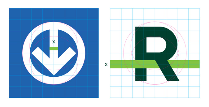
That one’s simple: R is the first letter of the REM’s full name, Réseau express métropolitain. The R also refers to the French words rapide, responsable, rassembleur, Rive-Sud and Rive-Nord (fast, responsible, unifying, South Shore and North Shore), among others—all of which are intrinsic to the REM identity and what sets it apart.
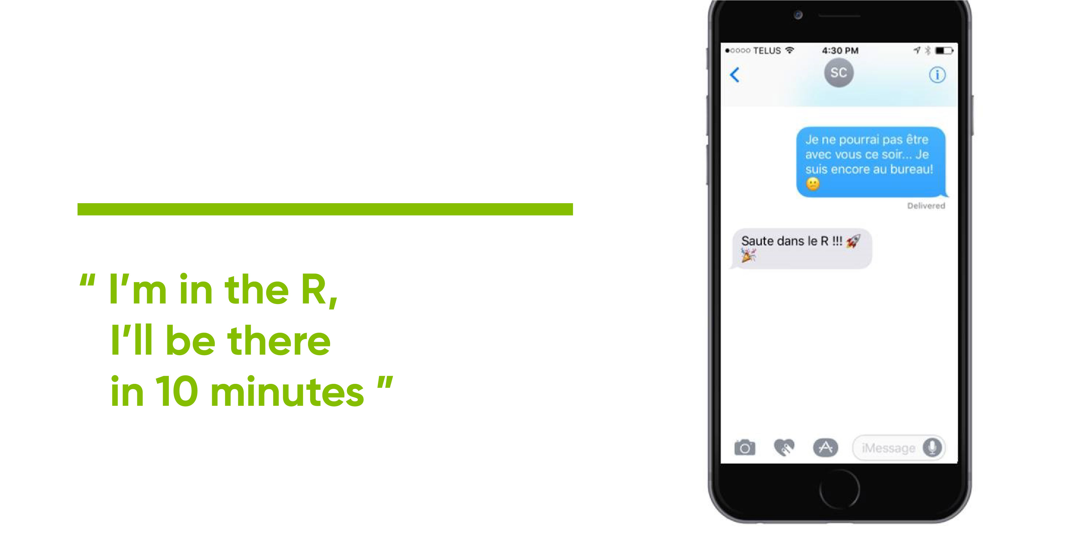
The letter alone, written clearly and plainly, is easily identifiable on distant signage. The R is also easy to use in natural, everyday language in both English and French.
Lastly, in French, the letter R is pronounced the same as the word air, evoking the new transit line’s light and aerial qualities, as well as the aerial sections of the route which will set it apart from the Montréal metro.
Why green? Why not red?
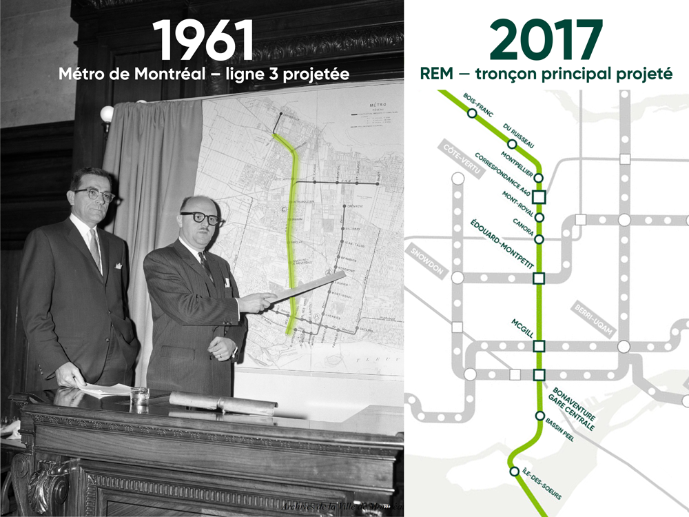
We had considered using red for the REM line as a nod to Line 3 (a.k.a. the Red Line), a metro line that Jean Drapeau had envisaged in 1961 but which never saw the light of day.
However, we came up against several issues in connection with the future signage. For instance, red is a colour frequently used for emergency exits, or to indicate danger or things that are not permitted.
While the colour green may call to mind the green metro line, we believe users will be able to identify the letter R with the line more so than the colour.
Having the R sport the colour green signals the effort to blend perfectly with the surrounding environment along the entire route. Green also symbolizes the environmental benefits of the REM, including the fact that it is electric and will help reduce GHG emissions by 680,000 tonnes over 25 years of operation.
What does the line signify?
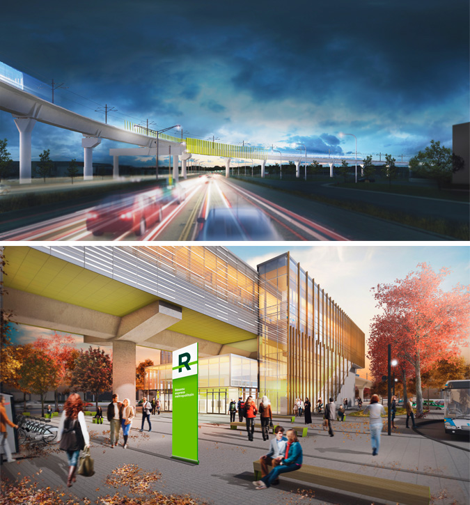
The notion of the line is integral to the REM identity. In the logo, the line is visibly integrated with the R, going above, below and through the letter. This movement illustrates the overhead and underground parts of the REM’s route.
The line also served as inspiration for the station architects. Certain REM structures, such as the elevated section above Highway 40, feature a line. The lines in these elements evoke the movement and speed of light rail. These lines are also found in the architectural perspectives of the stations.
And how do the other networks factor in?
The R is also intended to firmly position in the Montréal landscape a new technology that is neither the familiar underground metro nor a traditional commuter train. The REM is a hybrid, offering the speed and frequency of a metro line but connecting stations over a distance more typical of trains.
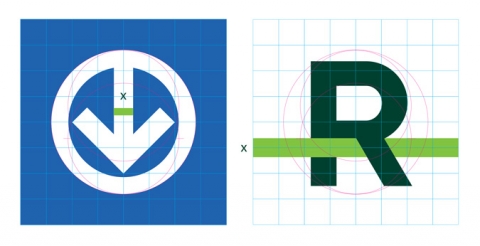
From the very beginning of the R’s conceptualization, careful consideration has been given to how it marries with the identities of the existing transit systems. In fact, it is designed to be proportional to the metro logo.
Further thought will be given to all facets of the indoor and outdoor signage in order to incorporate the principles of universal access.
... and now, find the R!