REM colour themes
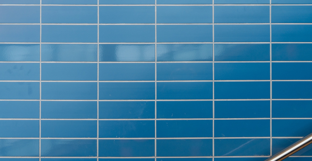
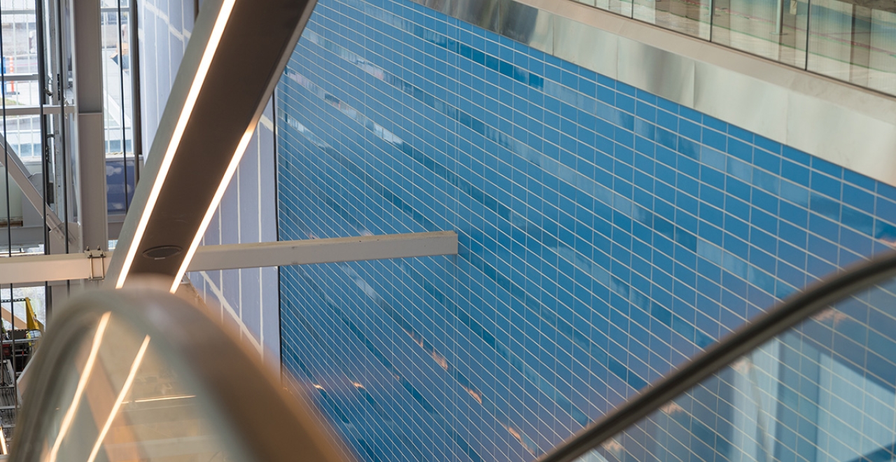
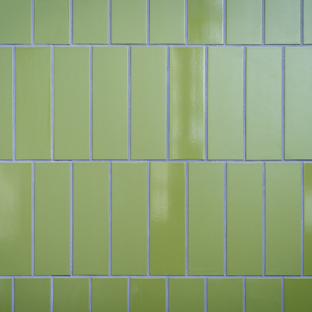
The Réseau express métropolitain (REM) has adopted a unique colour system for its stations. The specific colours and patterns that distinguish them are inspired by the places through which the light rail passes. The colour strategy extends to the ceramics and floor tiles used in the stations, as well as the street furniture and plantings around the stations . Each station has its own distinctive pattern, combining matte and glossy tiles for added texture.
Here are the six colour themes used throughout the REM network along with their meanings.
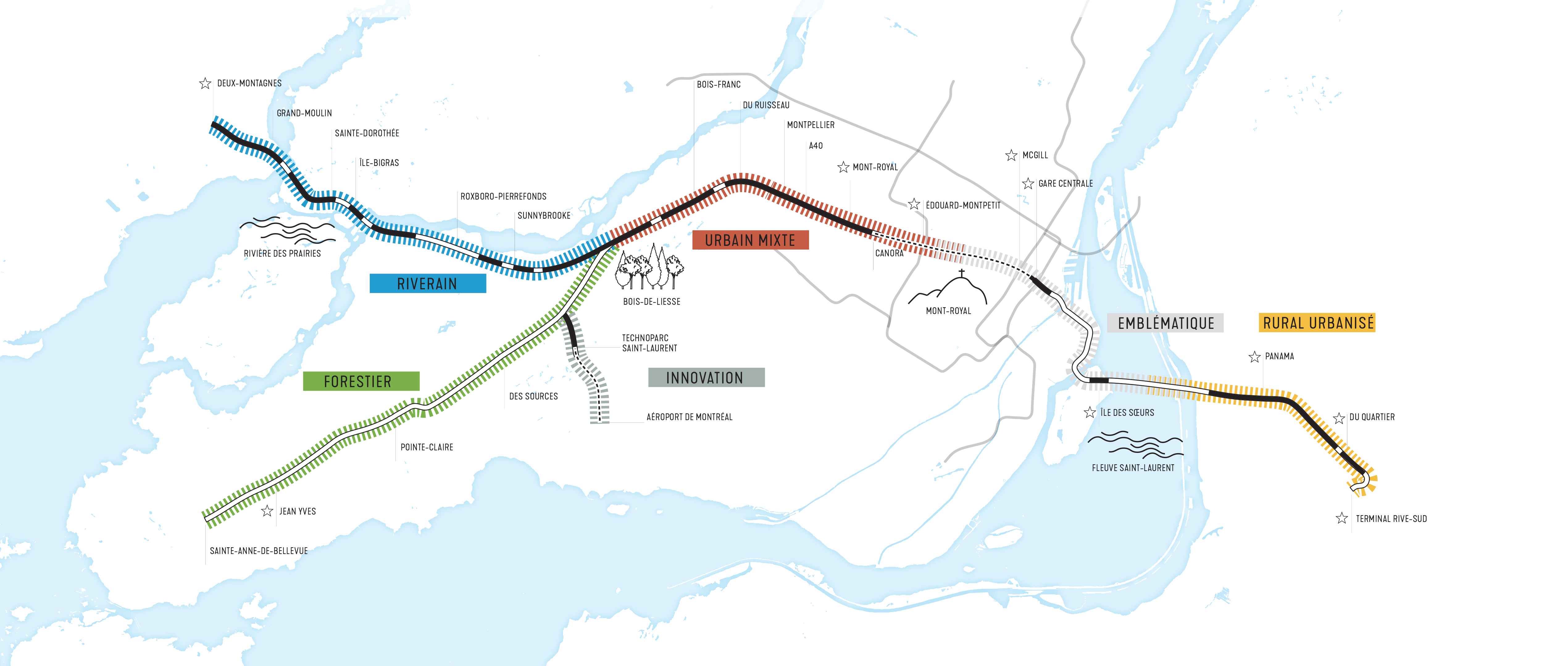 Map of the different sectors
📍Sector: South Shore
Brossard, Du Quartier and Panama stations
Urbanized rural theme (yellow)
The urbanized rural theme at the Brossard, Du Quartier and Panama stations draws on the area’s agricultural past. The colour of the wall tiles brings to mind wheat in the fields.
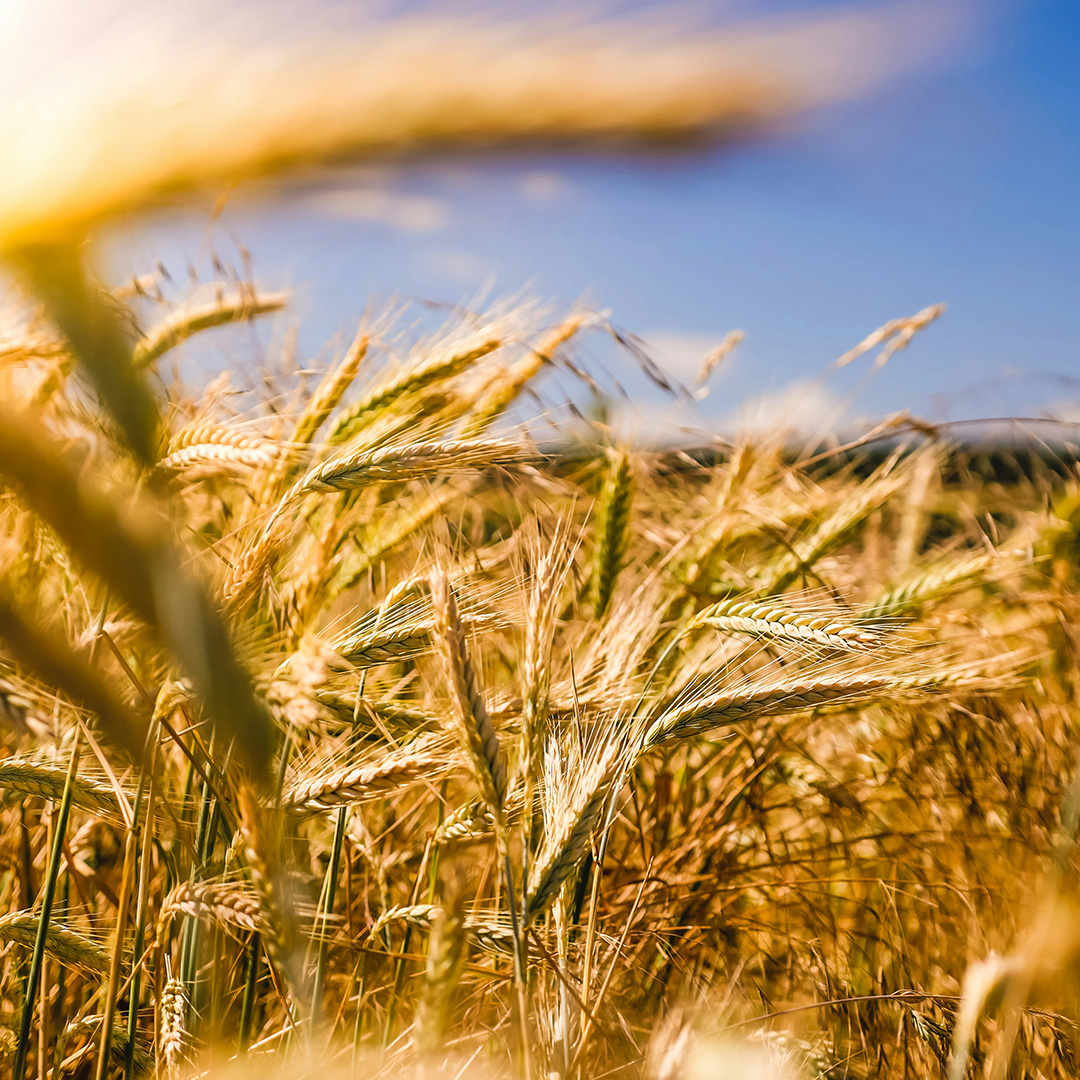
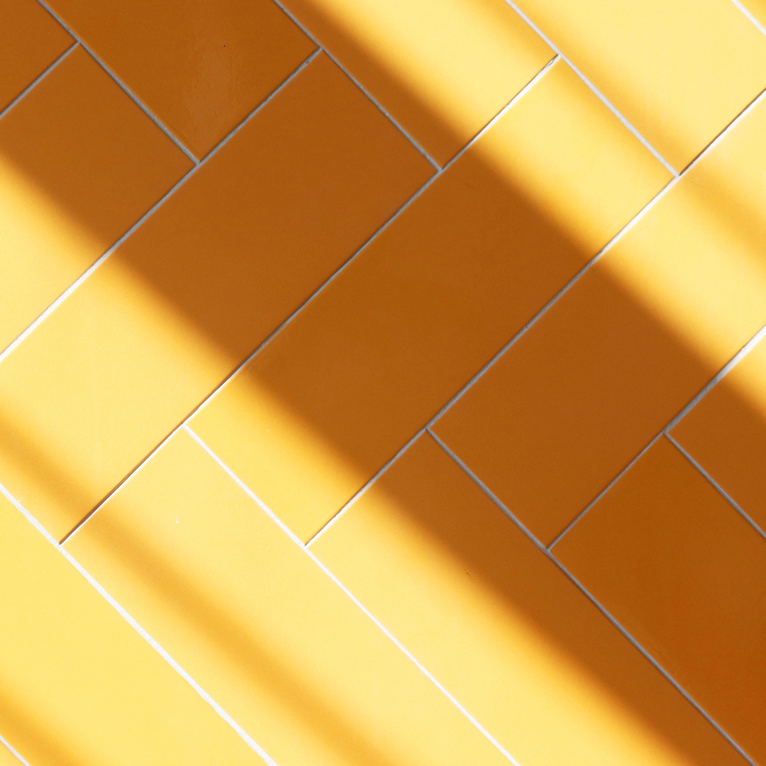
The herringbone pattern of the ceramic integrates traditional elements in a modernized setting.
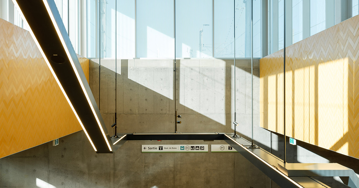 Brossard station
📍Sector: Downtown Montréal
Île-des-Sœurs, Gare Centrale and McGill stations
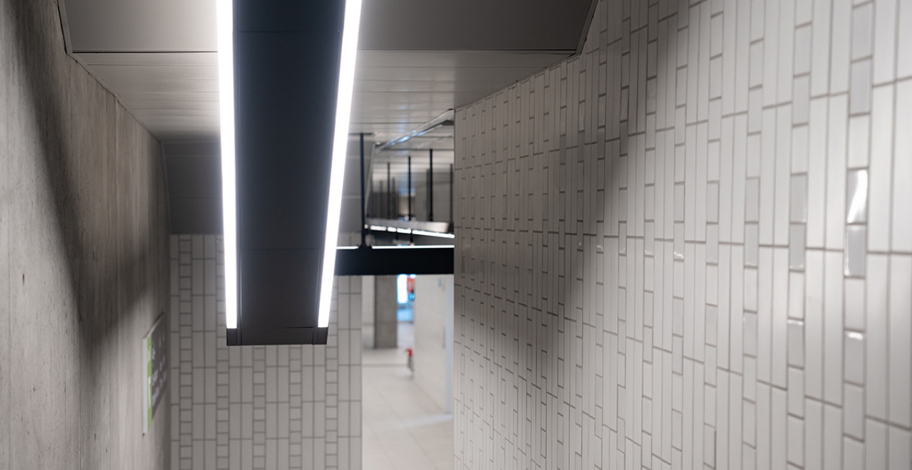
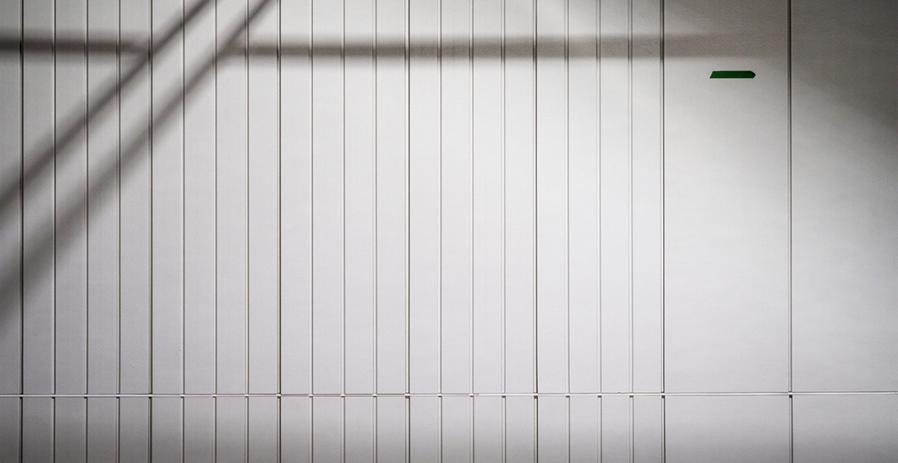
Emblematic theme (white)
Îles-des-Sœurs, Gare Centrale and McGill stations are inspired by the emblematic theme. The choice of cream for the ceramic highlights the elegance and iconic character of downtown Montréal. The patterns blend with the prestigious urban architecture to create a refined ambiance.
📍Sector: Centre of Montréal
Édouard-Montpetit, Canora, Ville-de-Mont-Royal, Côte-de-Liesse, Montpellier, Du Ruisseau and Bois-Franc stations
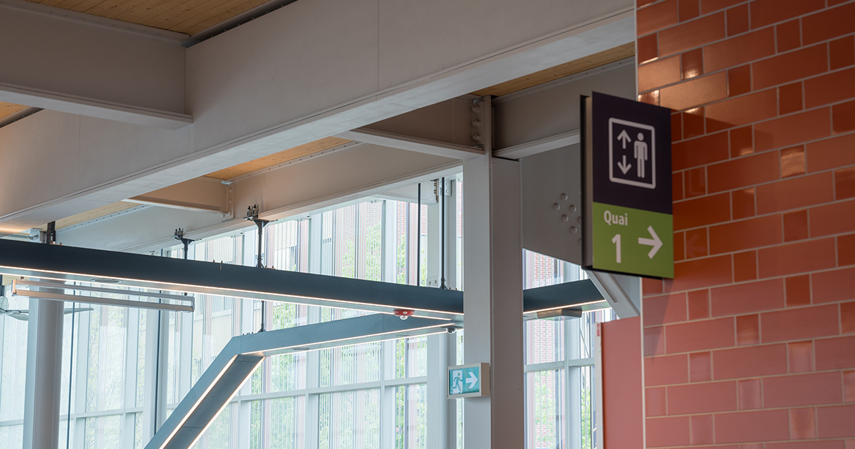
Mixed urban theme (red)
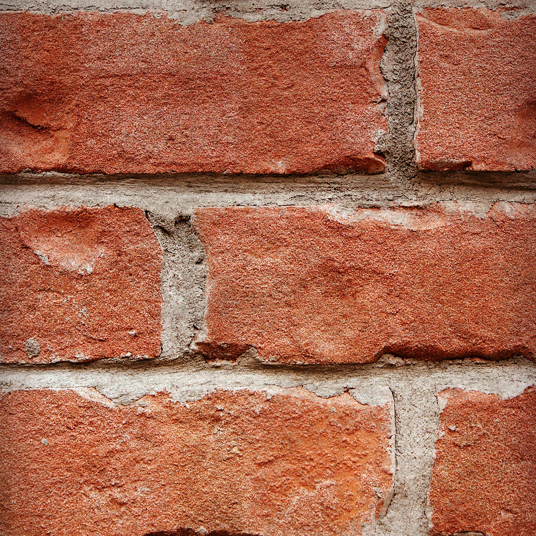
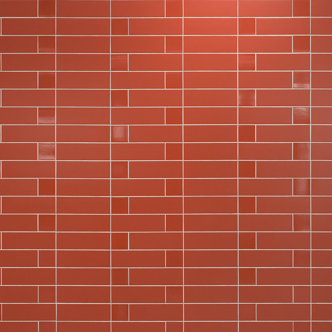
The red colour chosen for the ceramics of the stations under the mixed urban theme is reminiscent of the colour of brick, typical of the masonry seen in industrial and residential neighbourhoods like Saint-Laurent and Ville-de-Mont-Royal. The rectangular patterns are inspired by the cladding of the buildings found in this area, reinforcing the urban identity.
📍Sector: West Island
Des Sources, Fairview-Pointe-Claire, Kirkland and Anse-à-l’Orme stations
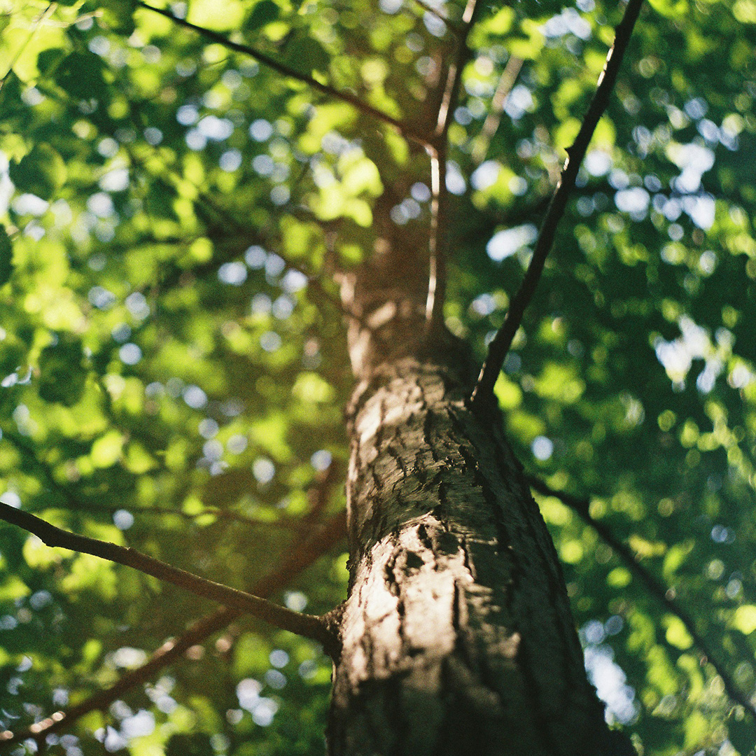
Forest theme (green)
Forest green emphasizes the proximity of the West Island’s many parks. The vertical patterns on the ceramic walls evoke the verticality of tree trunks and bark, creating a natural visual continuity.
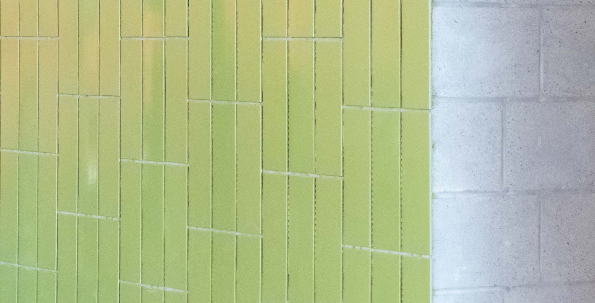 Fairview-Pointe-Claire station
📍Sector: North Shore
Sunnybrooke, Pierrefonds-Roxboro, Île-Bigras, Sainte-Dorothée, Grand-Moulin and Deux-Montagnes stations
Waterfront theme (blue)
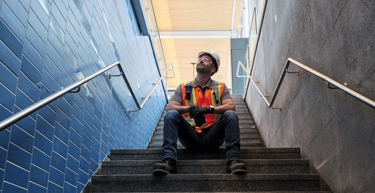
The use of blue is inspired by the Rivière des Prairies and makes a visual connection with the aquatic environment.
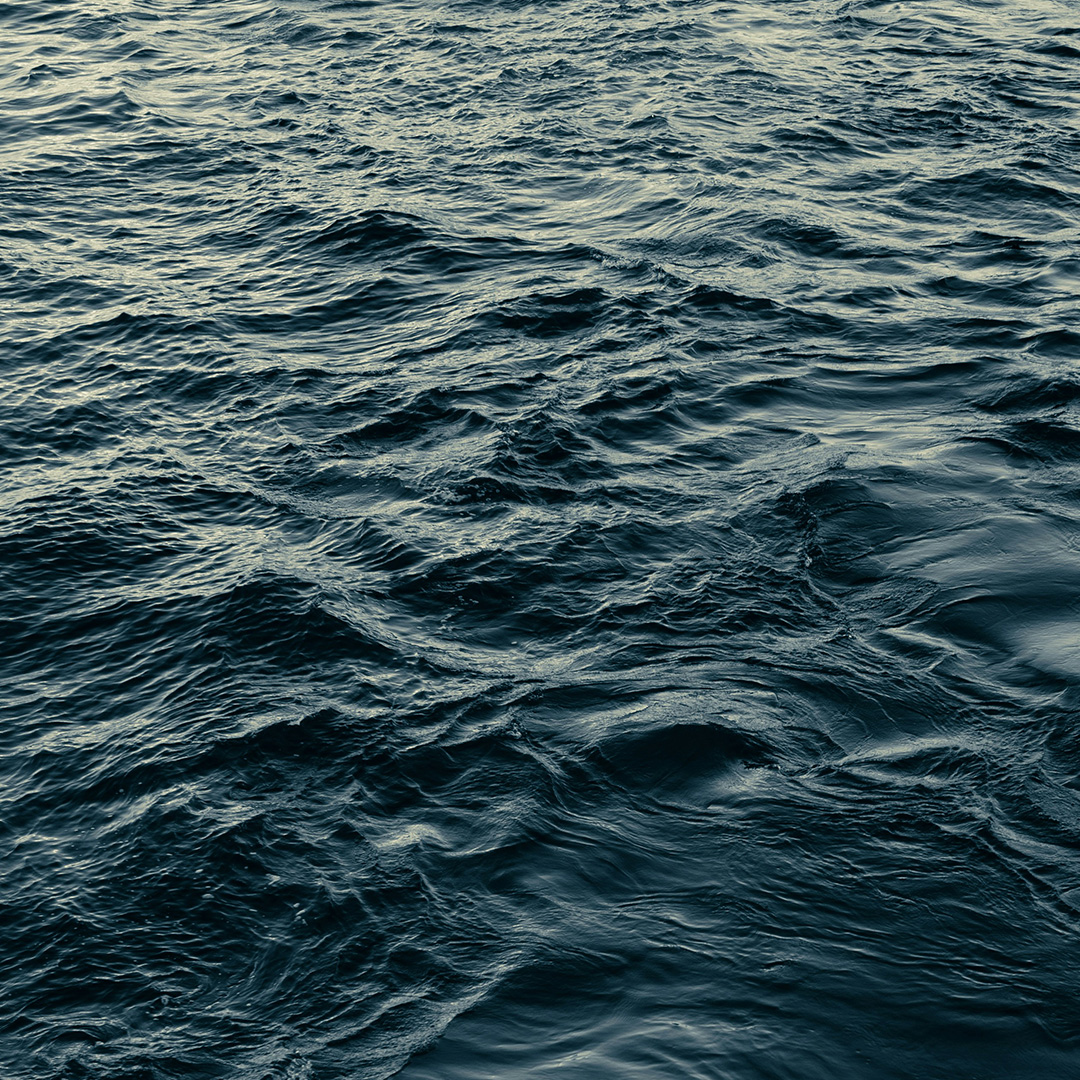
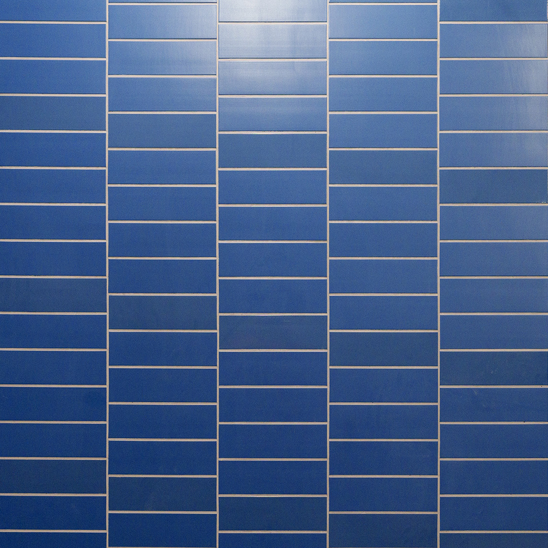
This colour conveys a sense of calm and fluidity, symbolizing the connection between nature and the city.
📍Sector: Montréal–Trudeau Airport
Marie-Curie and YUL-Aéroport-Montréal-Trudeau stations
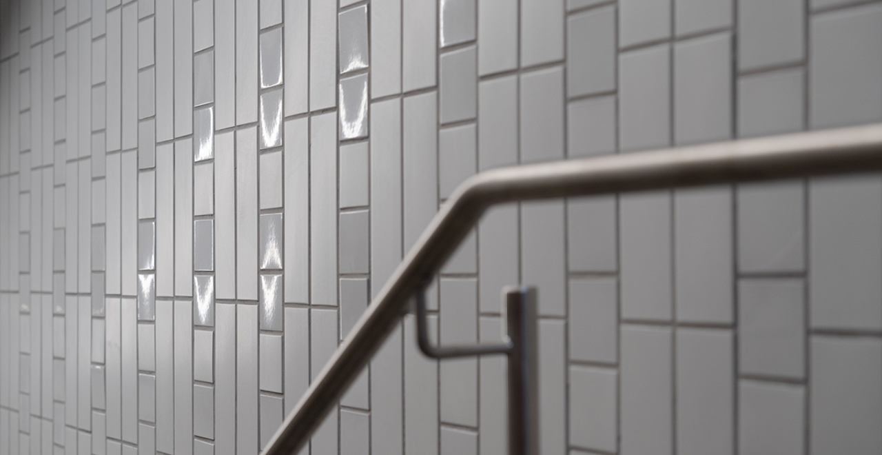
Innovation theme (grey/silver)
The silver colour reflects innovation and modernity, in keeping with the airport area’s lively atmosphere. The patterns and textures on the ceramic add a futuristic, technological touch.
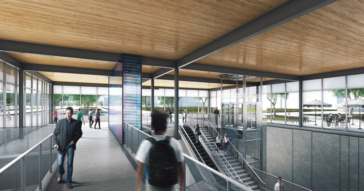 Rendering - Marie-Curie station
